arrow box1 boy1 boy2 boy3 digital-screen filter1 filter2 filter3 girl1 girl2 monitor main-image.png

We're a Group of Responsive Web Design Pros

At Webgen we're specialists in responsive website design. We'll provide you with a custom web design that satisfies your requirements and also aligns well with your brand.

Let’s build a great website together

img
image

One Site For All Devices

Your responsive website will alter its design according to the device display size. We'll supply an eye-catching custom responsive site according to your requirement with no compromise with the quality. An emphasis on cutting-edge layout and Contemporary usability criteria.

Why Choose Webgen For Your Responsive Web Design?

image

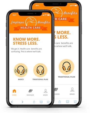
Anywhere, Any Device

IPhones, Androids, tablet computers, computers, monitors, you name it. Responsive web design will create your website versatile for any apparatus to view on. Even wearable devices like smartwatches will be able to format your web design and display information from the website. The present trend is shifting toward mobile-first design, meaning your website should be mobile-device-friendly above all else. We strategically compact all the information you need on.

Latest Tech

As an expert responsive web design agency, we employ the most recent technology and cutting-edge practices to develop and create beautiful and functional responsive websites for each of our customers. You know you're getting the best, because we only use the best technology as we construct.

Refined Code

We utilize the most flexible and refined programming environments and languages to build your responsive site. Languages like CSS3 and HTML5 have long since replaced relics of programming and we use them as they permit automatic webpage sizing and flexible media recovery.

image

Advantages Of Hiring A Responsive Website Design Company

Increase Viewers

Over half of the internet traffic comes from mobile devices. When you have a responsive web design, you can access customers on both PCs and mobile devices, giving you greater versatility at reduced development costs.

Lower Maintenance

Overall, it costs less to exist on both mobile and desktop browsers when you employ responsive web design tactics from a responsive web design service. Instead of creating content plans for both mobile and desktop, you get a cohesive vision across all platforms. Furthermore, the one-size-fits-all model of a responsive web design means changes you implement are executed across the board.

Fluid Grids

Sometimes called "liquid layouts," this sort of grid system scales based on the user's screen, ensuring that all components resize in terms of one another. Proportions stay the same when web design uses fluid grids implemented in the code.

Optimised Videos and Images

Videos and graphics are some of the main design elements on a webpage. If they're blurry or the wrong size, then most users will quickly leave your website. Keep them engaged with meaningful and beautiful images and videos that help your bounce rate and increase your CRO.

Quick and Crisp

No more chunky graphics and buttons unaligned with text in the middle of the page; your layout loads easily for people to enjoy. User friendly navigation will help control the bounce rate.

Consolidated Analytics & Reports

Google analytics are optimized to a level that they can handle responsive reporting,tracking, monitoring and investigation. Layouts are so flexible that the website can re-arrange automatically depending upon the screen size.